
Turning insurance anxiety into a confident, self-led purchase
We designed a new self-checkout flow for personal health insurance on the Plum app, converting a manual, sales-led journey into a story-first digital experience. I led the end-to-end design, collaborating with engineering, product, and sales to simplify choices, build trust, and help users cover what their employer insurance doesn’t. From rider education to eligibility logic, every step was built to feel human, not transactional.
The story at a glance
💼
Business Goal
Launch a scalable D2C retail health insurance flow
🙋🏻♂️
User Need
Understand, compare and buy insurance with clarity
💡
Our Bet
Build a story-first, expert-backed, trust-driven checkout
Why this, why now?
Plum had been offering personal (retail) health insurance only through its sales team, handling everything manually via WhatsApp or calls. There was no digital checkout flow.
Leads came from in-app banners and were 100% inbound
Sales reps manually shared quotes, captured info, and helped complete purchases on insurer portals
Our goal: Build a digital self-checkout journey that also enables sales-assisted visibility and intervention
This was also Plum’s first foray into scalable D2C insurance, opening a new revenue stream.
What were the users thinking?
We had to address a key psychological hurdle, users already had employer insurance via Plum. So, why buy another policy?
🤔
Why is employer insurance not enough?
👀
Why should I trust Plum for this too?
❓
Why should I buy this now?
We learnt that users:
😵💫
Often didn’t understand what riders, room rent, or add-ons meant
👵🏻🧓🏻
Were motivated by family needs, especially for uncovered parents
🗂️
Dropped off when overwhelmed with jargon or too many choices
Design direction
We aimed to:
🔐
Build User trust in plan selection with minimal cognitive load
🧩
Avoid decision fatigue while still offering meaningful choice
📝
Support complex forms (medical + KYC) without overwhelming users
🚦
Design clear states for eligibility, edge cases, and failure handling
✨
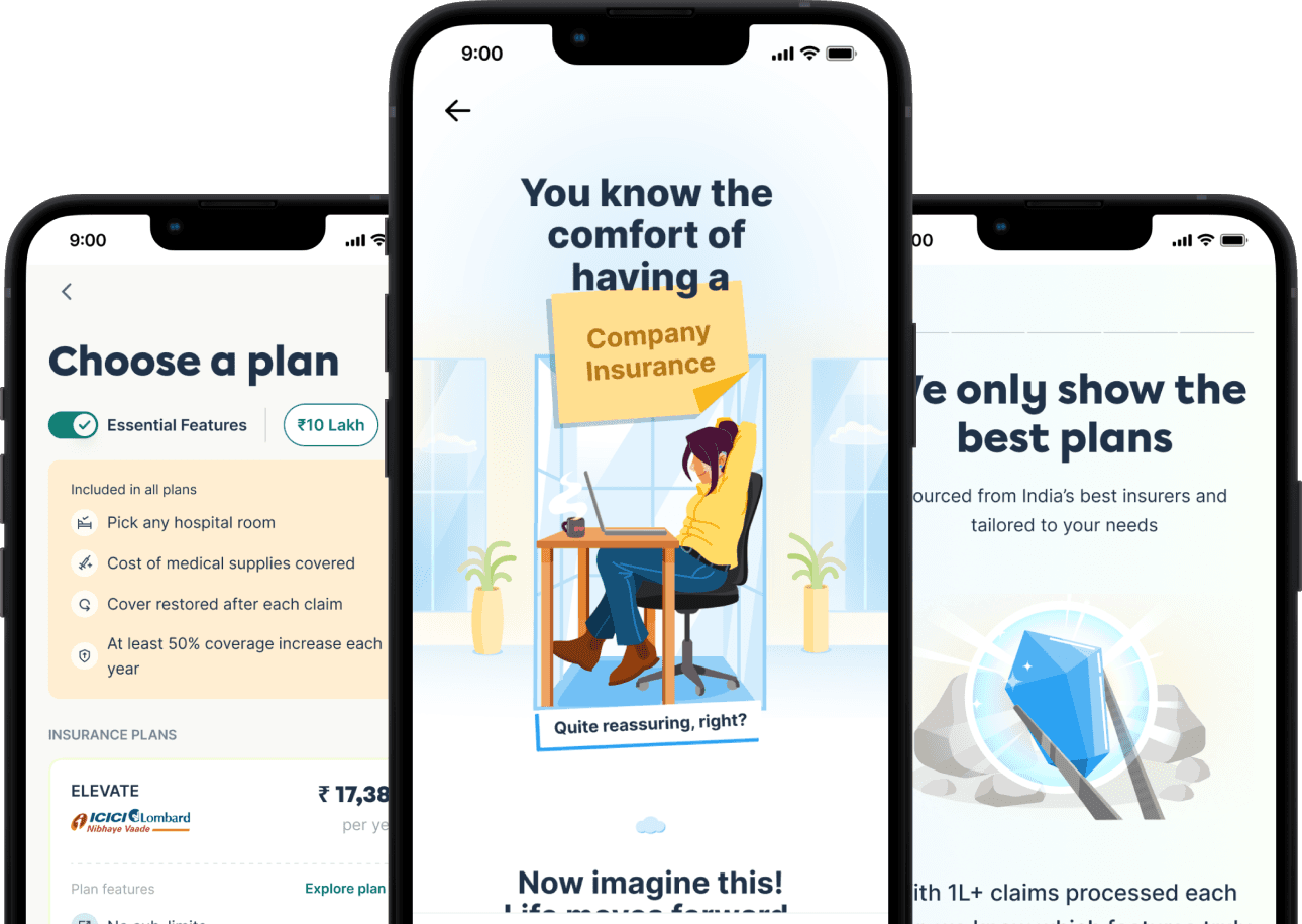
THE LANDING PAGE
Why Bother,
Why Here, Why Now
Sets the stage for conversion by addressing the three big user questions:
🤔
Why buy personal health insurance?
👀
Why buy this from Plum?
❓
Why buy this now, not later?
We partnered with the retail and sales team to understand how they pitch it — and built a similar story arc in product.

This version skips the user's core question — why buy more insurance — making the pitch feel generic instead of personally relevant.

Feels safe and polished — but still no pitch, no urgency, no real reason to act now.

Feels like a stat card, not a landing — no arc, no build-up, no real pitch.
Lacks the story-telling arc.
Arriving at the landing page solution
We settled on a story-first approach that introduced a relatable tension, what happens when your employer insurance falls short, and used that as the emotional entry point to build urgency and clarity before presenting the product.
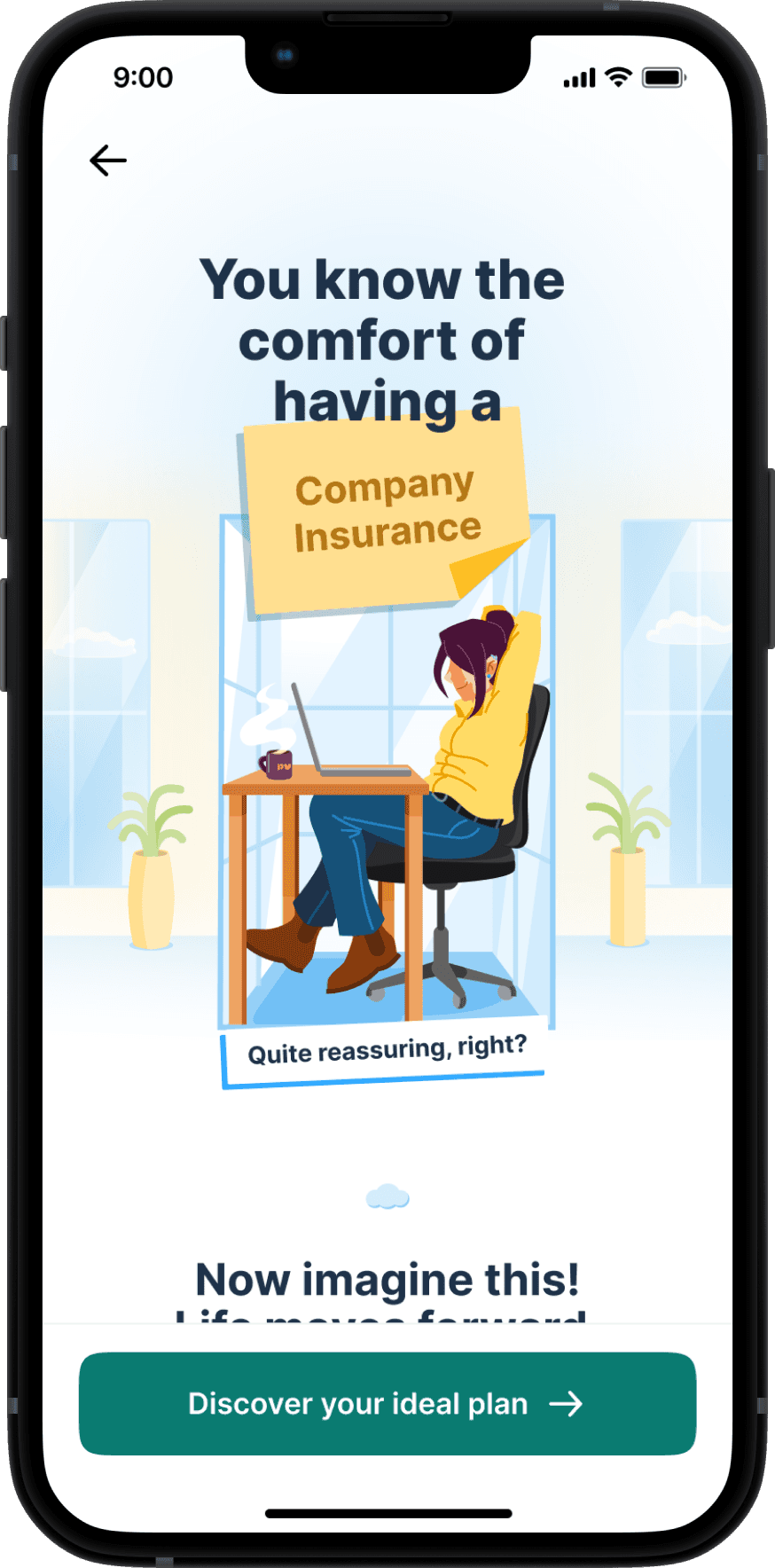
Setting the context with the comfort of employer insurance

Painting the picture of changing life and evolving priorities

Highlighting how Personal Insurance bridges the gap and grows with you
Final version of landing page that answers the real questions
Benefits breakdown
Help and FAQs

Social proof and real examples
Combining emotional storytelling with feature-rich reassurance
💎
Covering Input needs
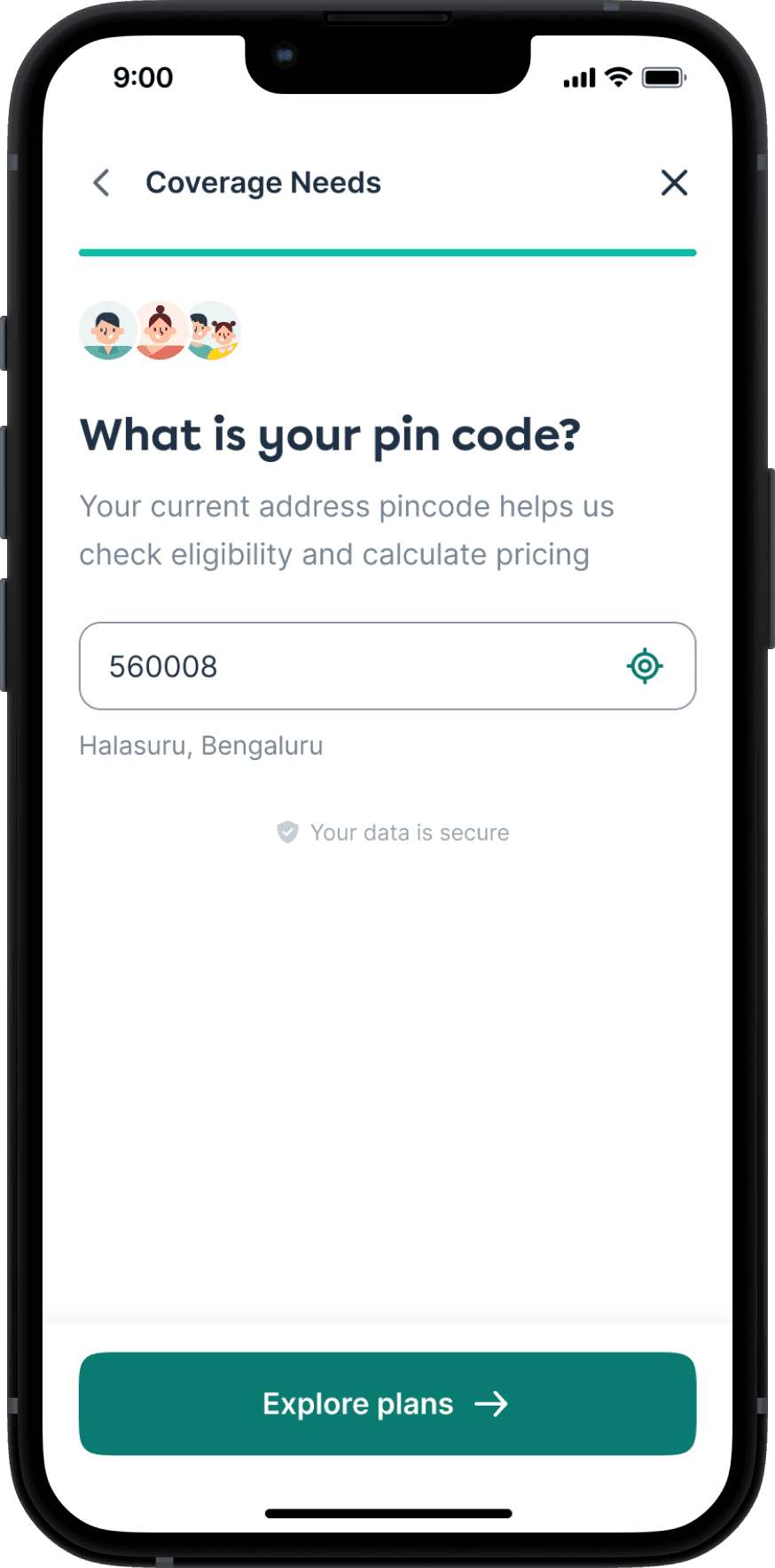
Tell Us Who You're Protecting
We need details like:
👣
Who to insure
🎂
Members' ages
📍
Pincode
This tailors the experience from the start, removes guesswork and makes users feel personally attended to.
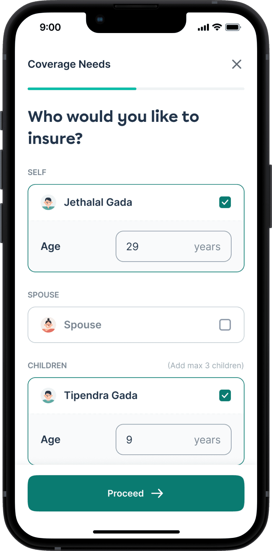
Instead of asking everything from scratch, we pre-filled family member data from users’ employer policy. This reduced drop-offs and effort, while allowing users to add additional members like parents.
🧠
Plan Recommendations
Plans that Actually Make Sense
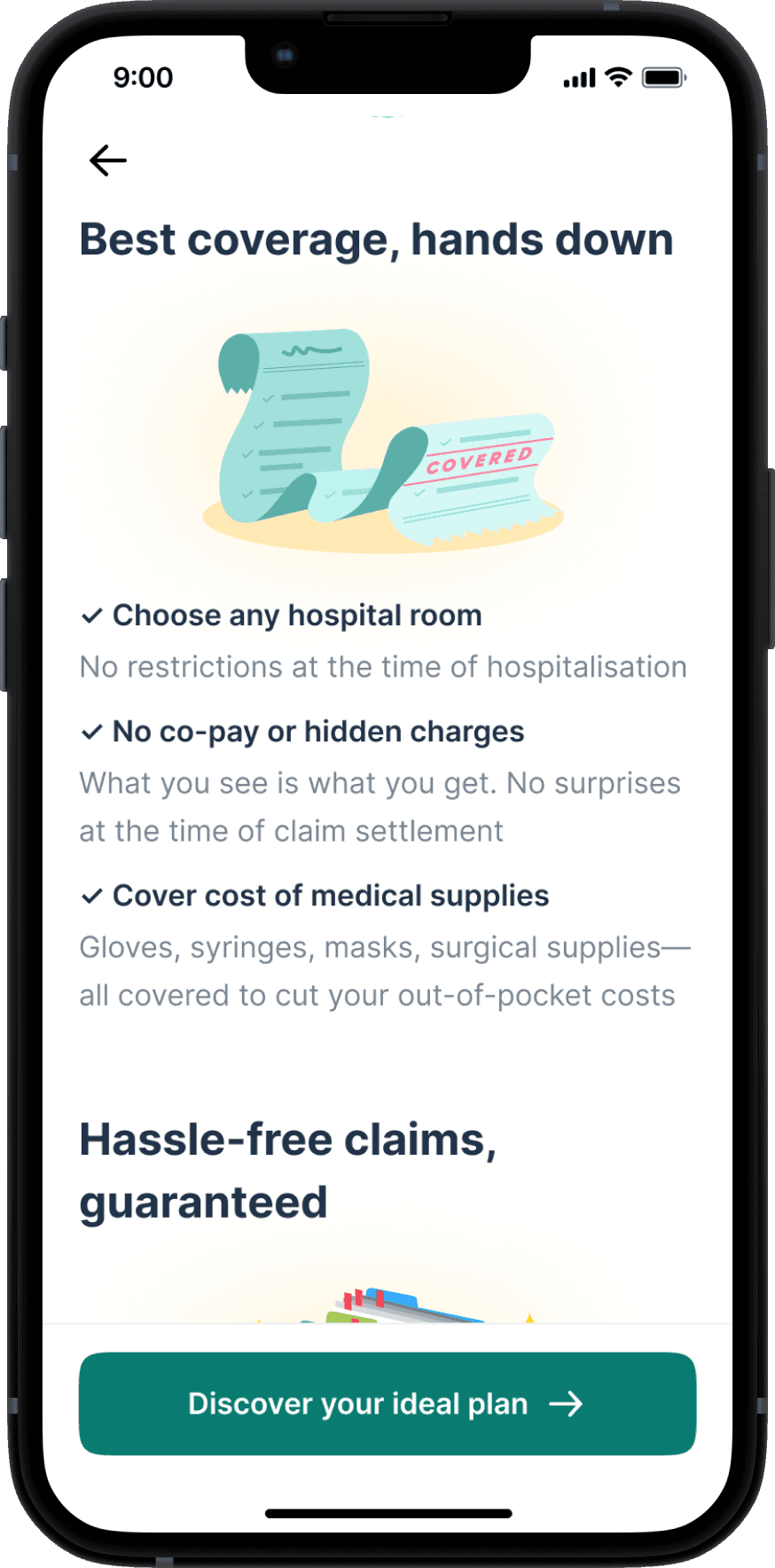
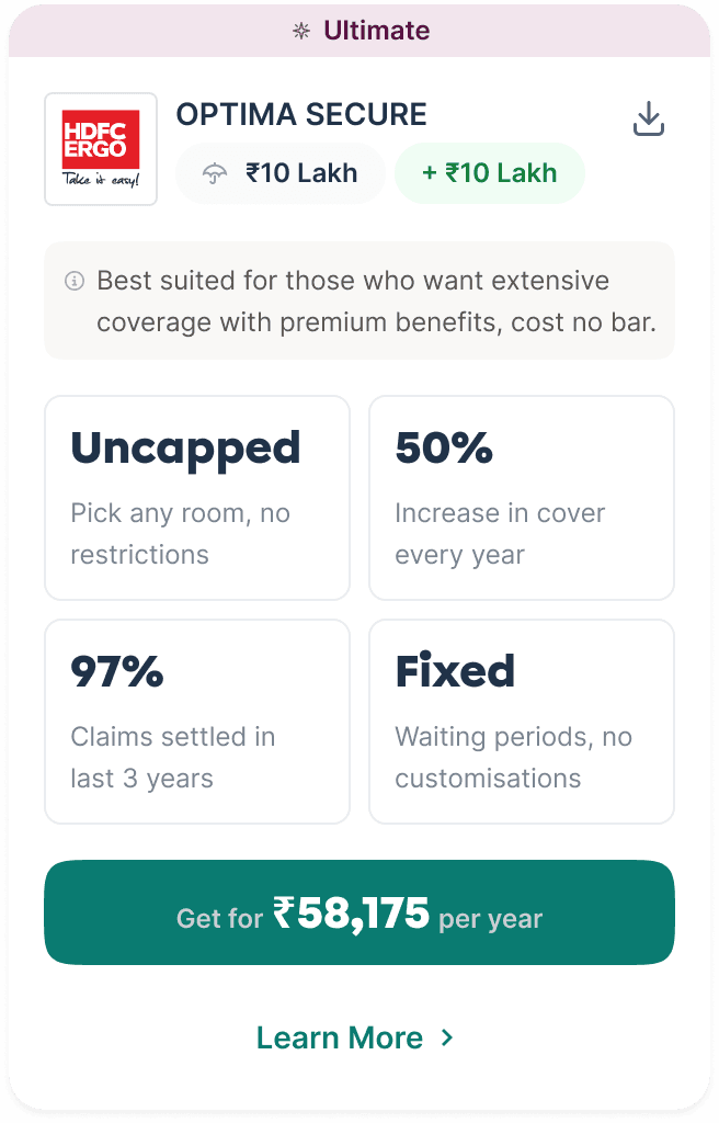
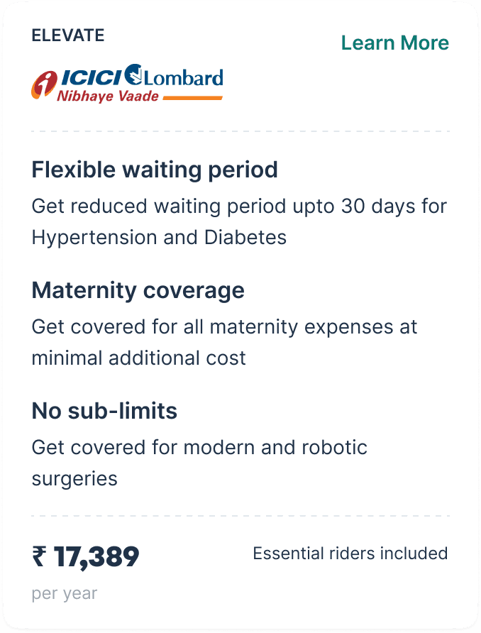
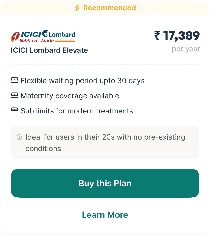
This was one of the most complex and high-stakes steps in the journey. We knew that plan selection could either build trust or completely break it.
Initially, we went with a standard card-based UI showing 3 plans and their features. But user interviews and input from the sales team made us realize that this wasn’t enough. Users weren’t familiar with insurance jargon like “capped room rent” or “coverage restoration” — and were more likely to pick the cheapest plan by default.
That was a trap.
Cheaper plans didn’t include critical add-ons, and users who picked them would later feel misled when they had to pay more for riders they didn’t understand.


Iterations on the Plan Recommendation Page
What is the meaning of 'Uncapped' and 'Fixed'?
What are essential rider?
Are there only 3 features?
How is this different from other plans with similar features?
Iterations on the Plan Cards
The sales team shared an insight that changed our approach:
In human consultations, they never pitch bare-bones base plans. Instead, they quote fully loaded plans with all essential riders pre-included, then suggest removals only if users ask. This ensured the price was accurate upfront with no surprises.
We brought that philosophy into product:
🍎
Include essential riders by default in all plans for an apple-to-apple comparison
⛱️
Introduce a toggle to remove riders to see the changes in price and coverage
🛴
Having an onboarding experience to educate users on the essential riders
👀
Adding subtle copy nudges encouraging them to keep the toggle on


Plan recommendations with and without riders toggle
We also added a brief onboarding screen before the plans appeared, explaining what these riders were and why they mattered. This gave users clarity and confidence before they even saw the options.


Introduction of plan features and essential riders
We replaced jargon with relatability, we rewrote terms like -
"Uncapped room rent" → "Choose any hospital room you want"
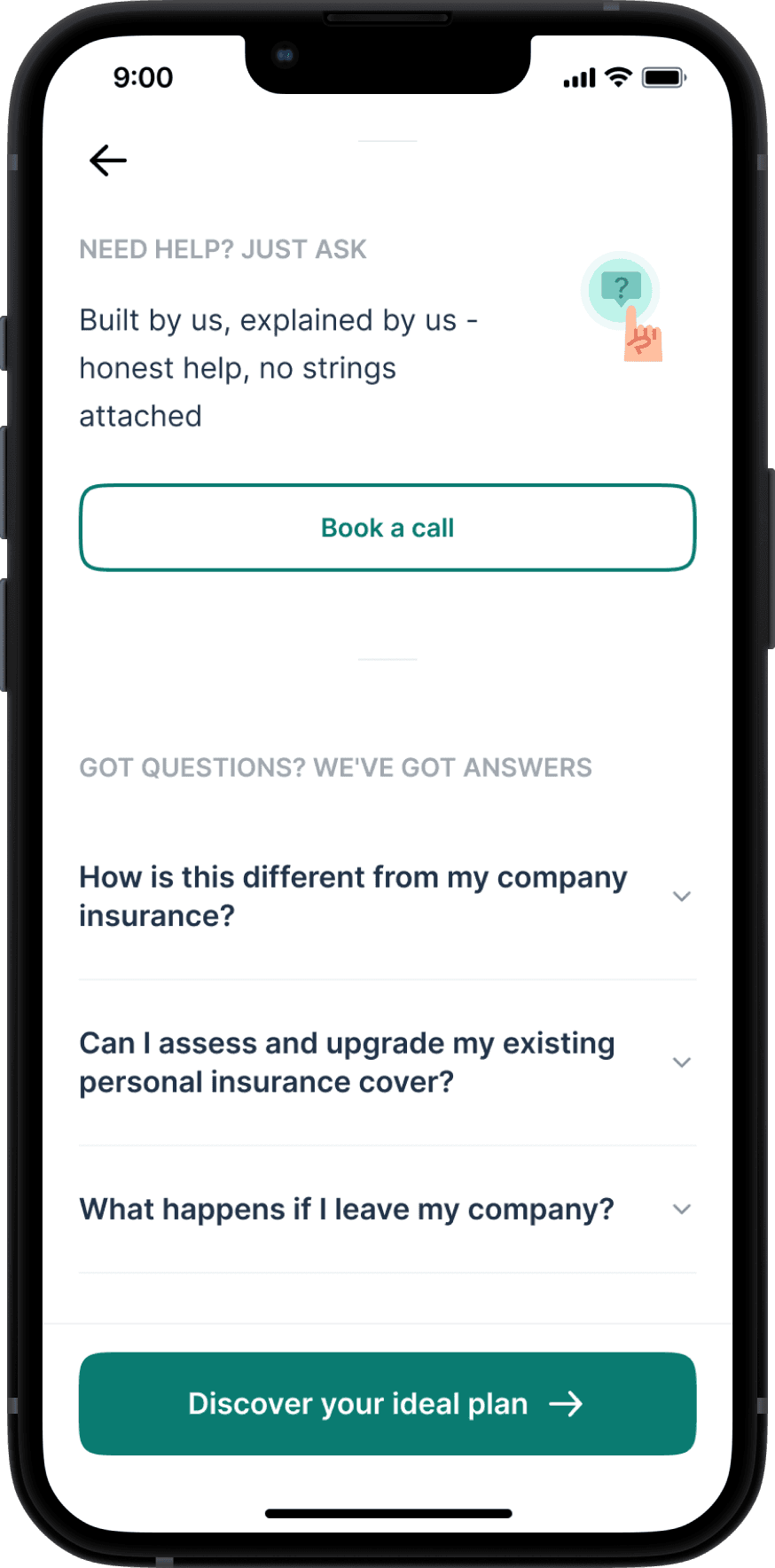
This reduced anxiety, built trust, and gave users just the right level of control. And if they still had questions, a clear CTA connected them to an insurance expert.
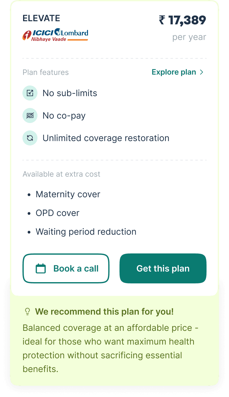

Updated plan cards
🕵🏻♂️
KYC DETAILS
Quick and Clean Compliance
Before we asked for family medical details, we needed to verify the primary policyholder’s identity.
This step included basic personal details and address validation. Since many users were already covered by employer insurance via Plum, we leveraged pre-filled KYC information wherever possible to reduce friction.
The result was a quick, almost invisible verification process that maintained compliance without adding cognitive load.
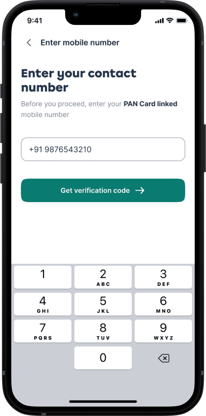


Smooth KYC process
🍇
Member DETAILS
Your Family’s Health, Upfront
This was the most detail-heavy part of the flow — collecting both personal and medical information for each family member.
🧱
The Default Industry Pattern
Most other players (like PhonePe or PolicyBazaar) used a rigid 2-step approach: first gather personal info for everyone, then switch to medical history. This creates a high mental load — users must remember what they’ve entered for each person, often jumping back and forth.
🫛
Our Approach: One Member at a Time
One person at a time, both personal and medical info
Matched how people naturally fill out forms in real life — one name, one story, complete in one go
Avoided context switching across family members, which is especially helpful when filling for 3–4 people solo


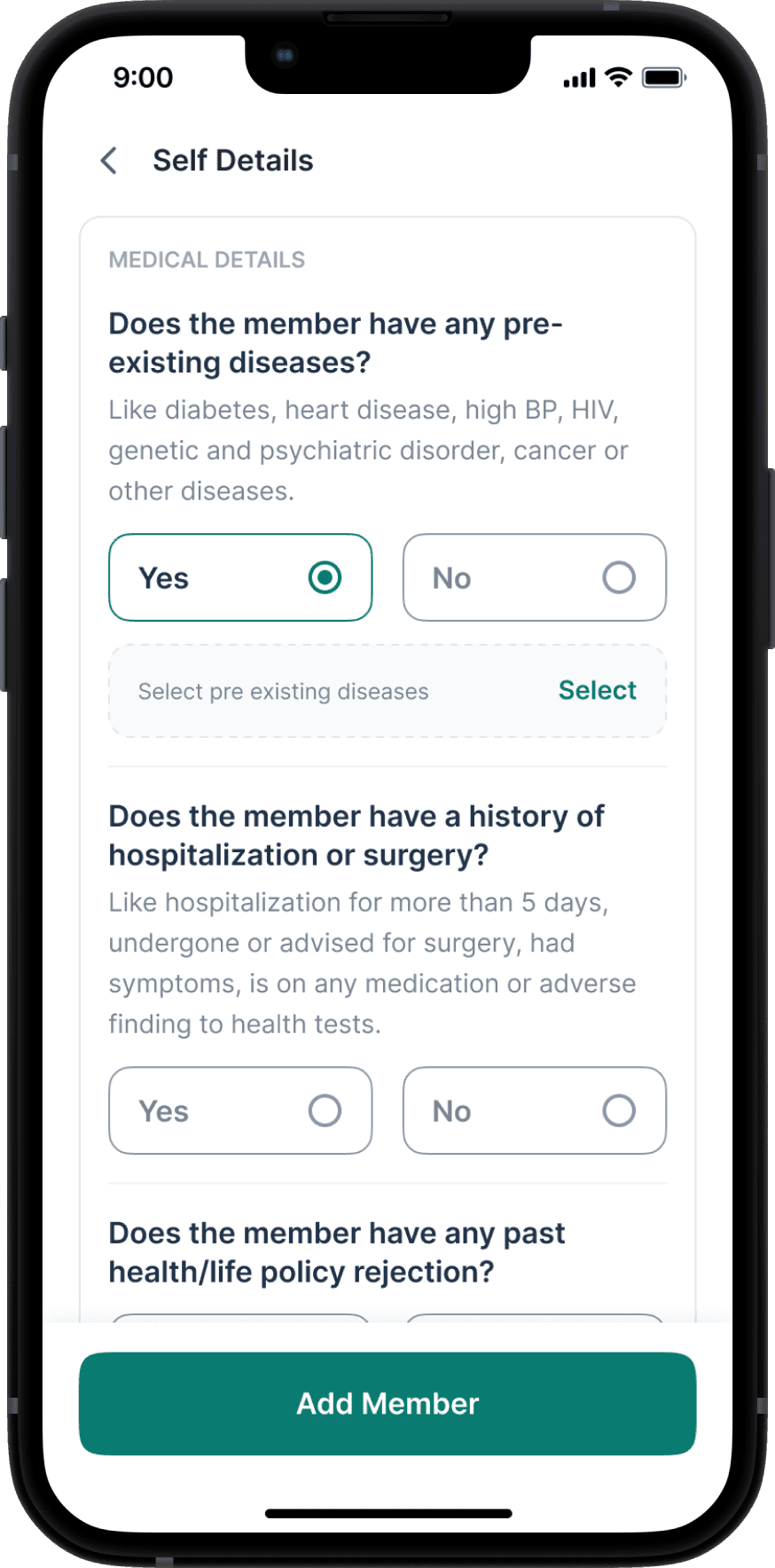


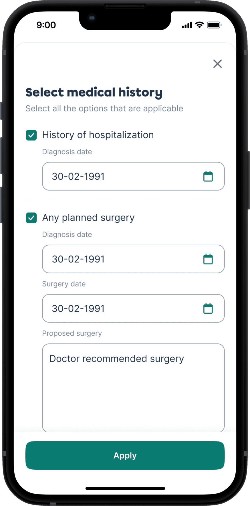
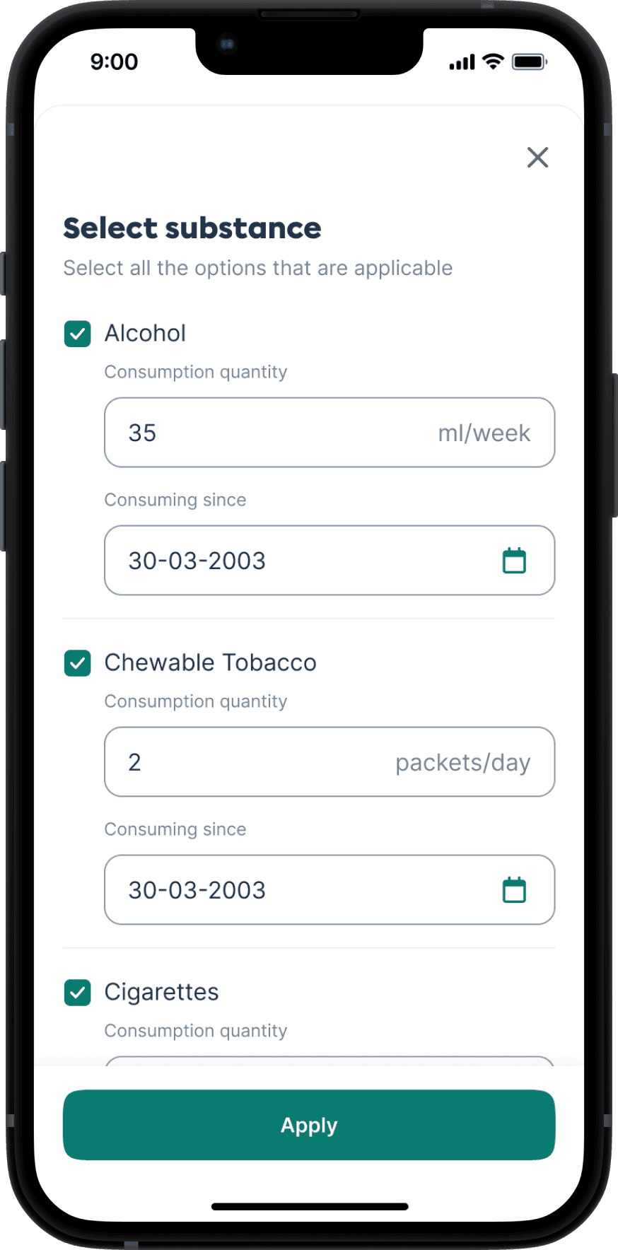
Personal & Medical Questionnaire
🚥
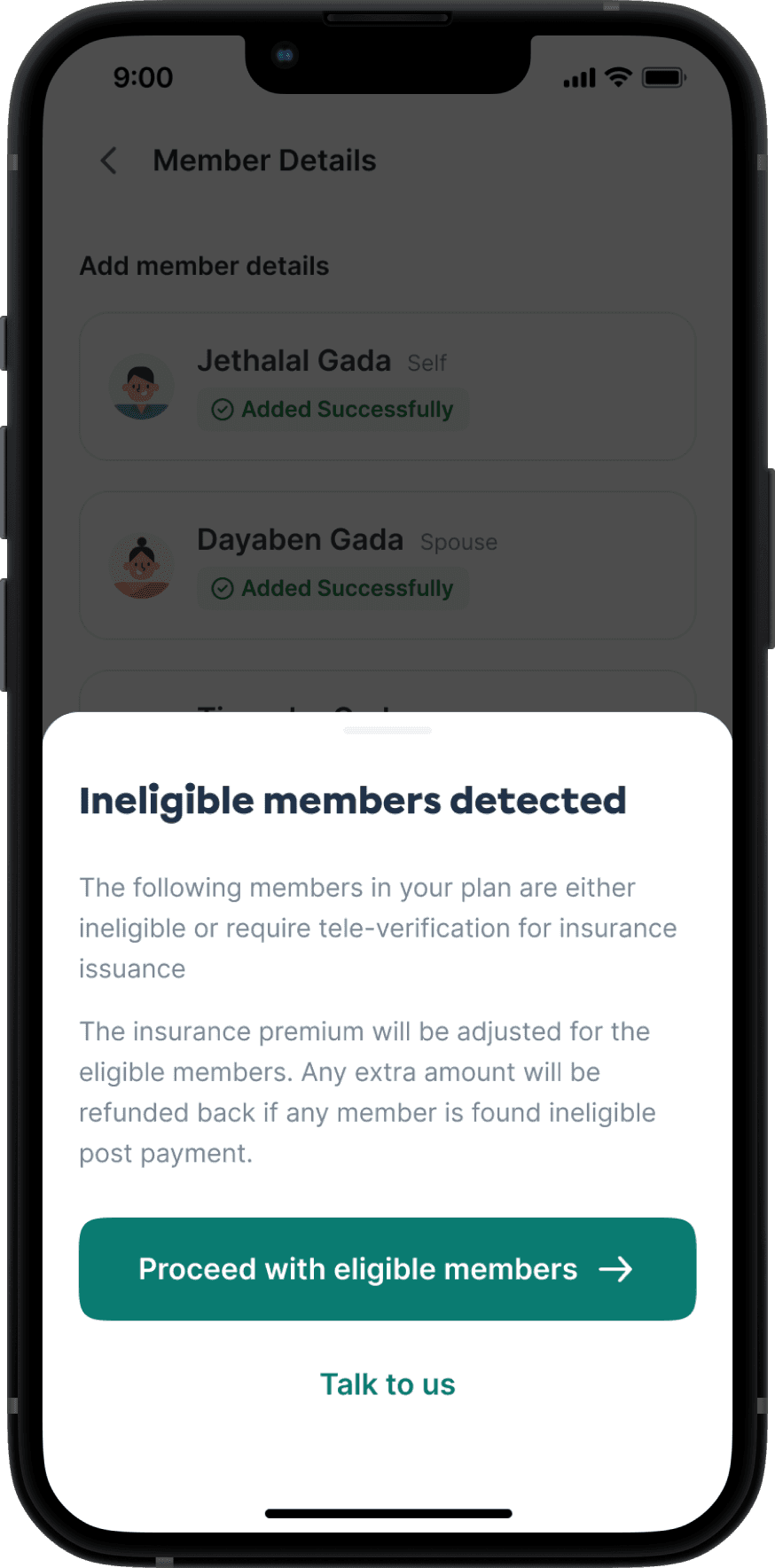
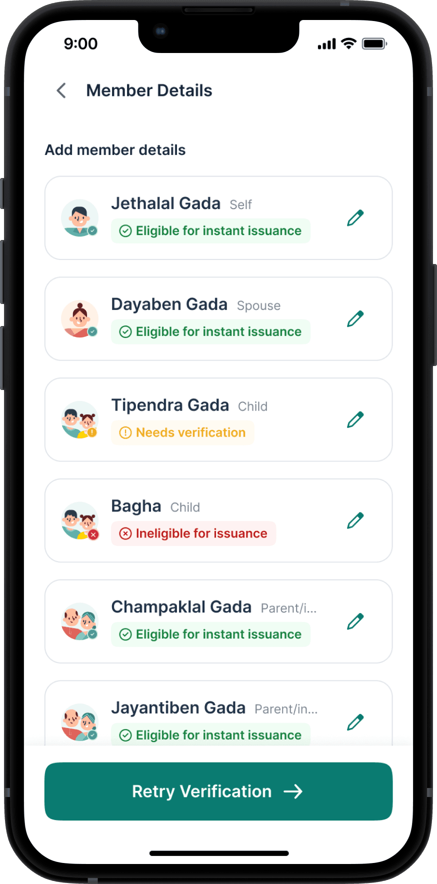
Eligibility Outcomes Made Clear
We surfaced health status clearly at the end of each member flow:
🟢 Eligible
🟡 Eligible post medical examination
🔴 Ineligible
The premium price of the plan also gets updated after detection of ineligible members


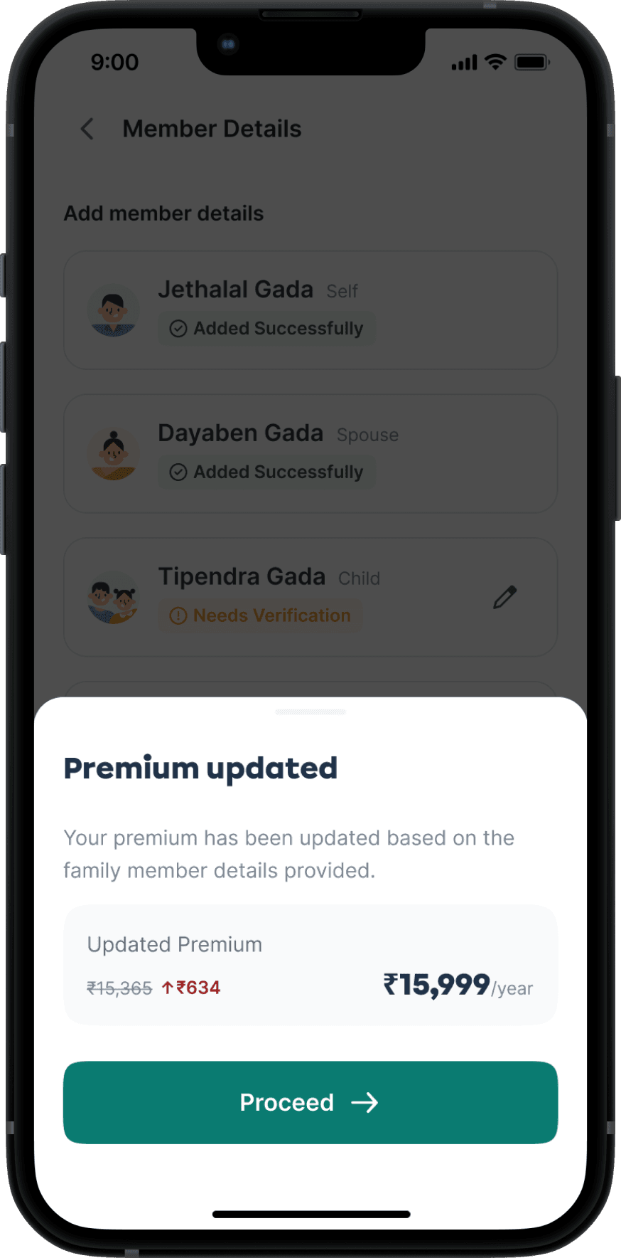
This section had the most complexity, but the final experience felt linear, calm, and grounded — just the way users needed it to be.
🏆
Checkout & Confirmation
The Final Step to Peace of Mind
The final flow included standard steps — payment, confirmation, success/failure handling.
But we added a key moment:
The user declaration was turned into a bottom sheet that could not be closed without accepting — improving compliance.


Checkout & Post-payment Experience
🌻
Post-purchase & Edge cases
Life Happens & We’re Ready
We handled:
Access to policy details
Claim process walkthrough
Payment failures, drop-offs, drafts, retries, etc.

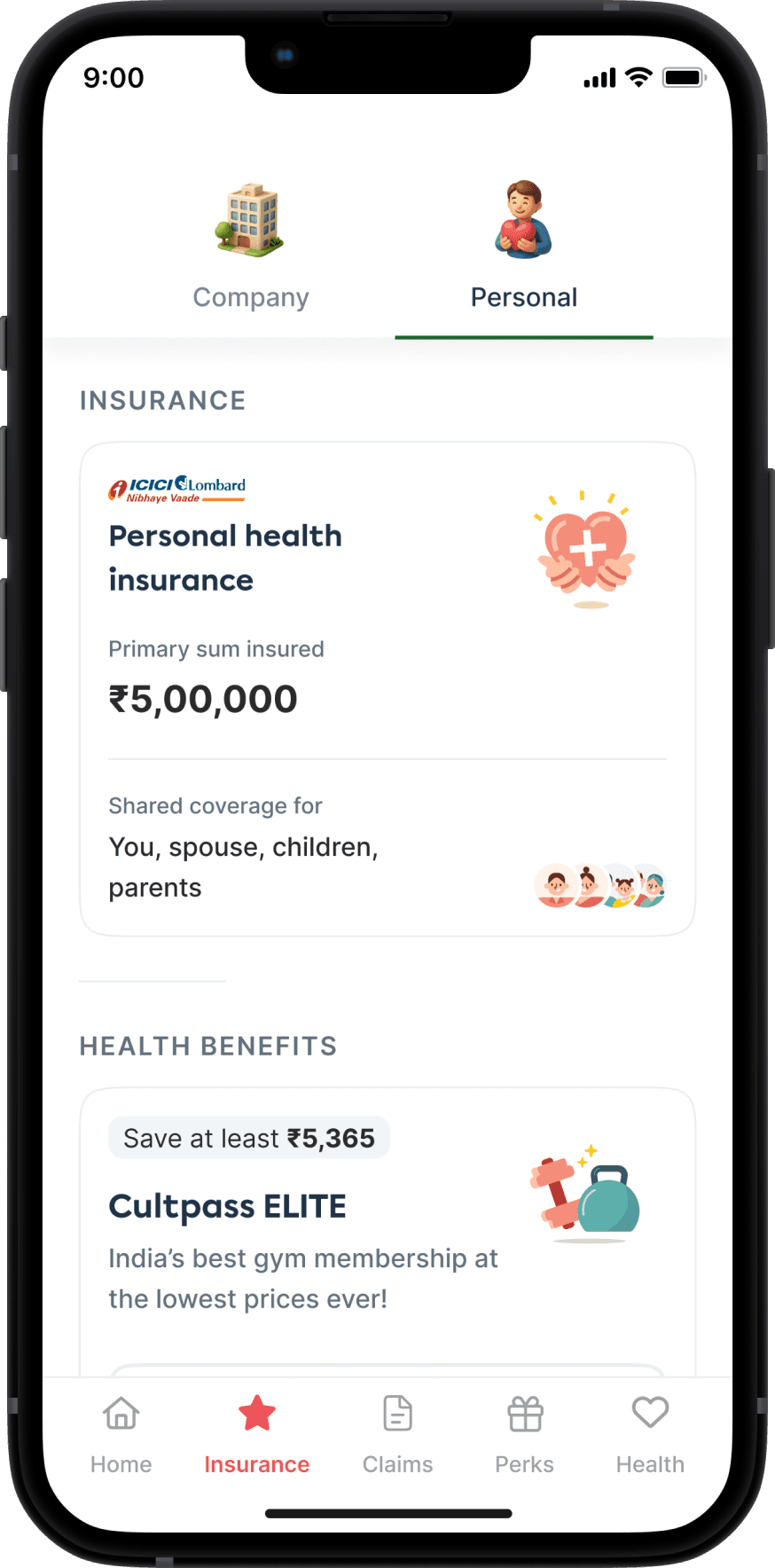

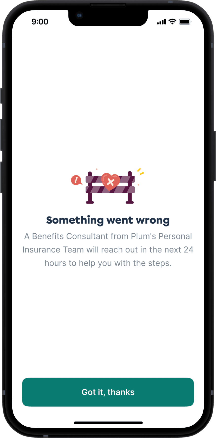


Checkout & Post-payment Experience
What I Learned
💭
People don’t understand insurance, but they want to feel like they do.
Helping users feel in control is as important as simplifying the flow
🪷
Trust is built subtly — through tone, visuals, transparency, and defaults
🗂️
Collaborating with sales shaped not just UI decisions but narrative framing
🍱
Sometimes the most user-centric thing you can do is reduce their choices — not add more
Want to peek behind the curtain?
This was more than just building a form. It was about turning an emotionally loaded, complex decision into a journey that feels calm, clear, and empowering.
Let me show you how the story came alive — from scribbled questions like “Why would someone buy more insurance?” to Figma flows, logic maps, and plan toggle experiments.


👋🏻 adarshsingh.3098@gmail.com
designed with myths at heart,
pixels in hand and stories that don’t sleep
🦗 It’s quiet in here. Click here to set the vibe.